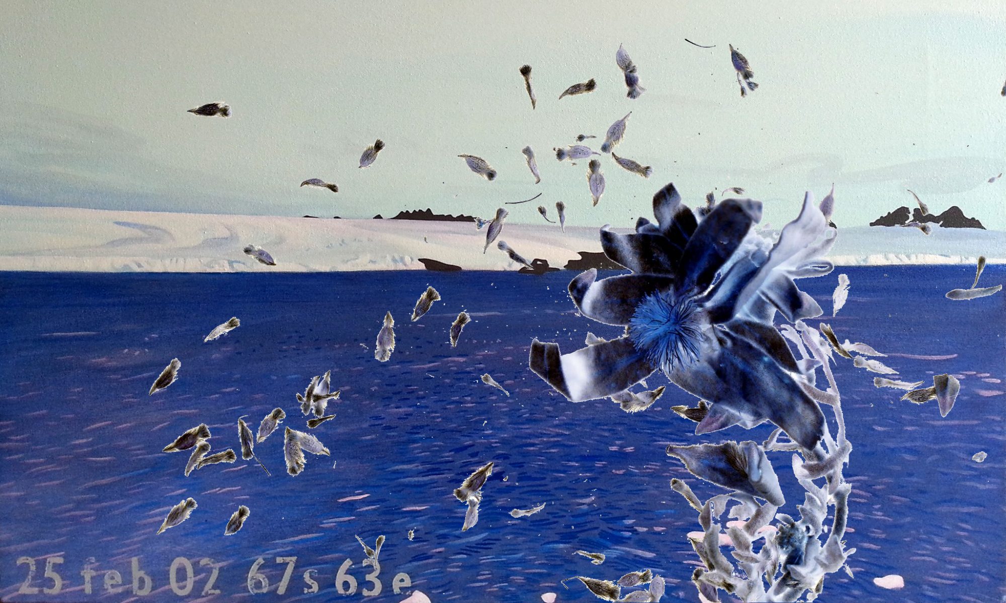
The Datascape Topography of Simon Pockley, and the Landscape Animation of Hobart Hughes, are the research practices upon which I aim to build, to animate Antarctic landscape changes observed and experienced.
.
.
“Landscape Animation involes timelapse, stop motion and sequence animation…You could describe Koyaanisqats as landscape animation.” (Hughes, 2007).
.
Listening to John speak about his work, it also seems to be a different way of seeing land.
“In deserts” he said, “the underlying landscape is laid bare”. (in con, 12 June 2007)
Walking through the desert around Broken Hill with bio-geologist Sam Mooney in 2003, he came to see it from other perspectives, a more objective perspective that explained the way it was, as if from the point of view of the land itself (non-homocentric).
.
.
“The topography of the datascape is shaped by the structural displays of a personal digital repository of texts, images and sounds…these texts are embedded in the datascape as cross referenced hypertexts.” (Pockley, 2005)
.
An Antarctic topography that interconnects scientific and aesthetic responses to its landscape, can be developed as an on-line repository of shared knowledge, through a thesaurus of interconnecting journeys.
Animating just some of these interconnecting journeys as an interactive film of DVD, is my present goal.
.
.
ABC Radio National, 10.30AM
Interview with…
about American youth how our idea of landscape is rapidly changing.

I notice that the way you have categorised your posts is creating your particular datascape. I wonder what an animated view of the quantitative data building up in the categories might reveal about your research practice?
While we have talked before about animating the words in your abstract, in a simplistic way I was just thinking of this as an animated graphical representation. Beside each category we can see the number of posts. But what if we could see how these numbers grew, and are growing, through time? You might transform the categories into images and the actual numbers into size (weight).
As there is nothing static about the alluvial process of laying down your thesis. Applying animation, as the language of change, might lead to a useful representation of the ebb and flow of our thoughts…
Hi Lisa,
Yes the desert like the land (landscape) ‘laid bare’
With all this rain the landscape is changing. The water was up to the base of the bridge on my way over the Abercrombie River yesterday afternoon. The road was pocked with holes full of water, which hides the depth of that hole. The holes stretched from one side of the road to the other. Spent some time at the national gallery in Canberra, visiting some friends (art works), saw Robert Smithsons ‘rocks and mirror square II’ and was struck by the greenness of the mirror glass, remembered when I first saw it in the Art Gallery of NSW, it has lost some of its attraction. Liked the Surrealist Map of the world with the traditional Masks placed along side the surrealists work. Gave me an idea of collecting the knotted netting from around my home to place along side my works in the Bathurst show. Those things that I collect are part of my art making process. They are points of reference.
This rain will change the collection of some things, the empty mussel shells in the mud of the Rylstone Dam will be covered by the new water, your never tread in the same river twice.
The big sand bank at the canoe creek and colo river junction may be washed away and the vegetation that has grown on it swept down the river too. The cave at Angwarra pool could be full of water, the last time we passed we camped in that cave, it was a dry haven out of DAYS of drissly summer rain. We had to swim to the cave.
If it keeps on raining I will not get to work tomorrow as the land will be covered with water and I will loose contact.
WordPress can be modified to a degree. What you suggest might be achievable, and the time required to do it would need to be weighed against its value to the research.
Translating numerical data to graphic representations would require some programming at a higher level that I know at this stage, and possibly include some Java scripting, requiring a download to view.
It has also occurred to me how I keep editing the categories, through adding, subtracting, renaming, and rearranging their hierarchical structure. These changes reflect the changes and refinements in thinking about which I am writing in the posts.
Tracking these changes visually could be of interest too, but I have not found a way to graphically represent these within WordPress.
Another way to chart these changes could be to draw a flow chart as a static representation, and use that as a basis for animation.
I am finding WordPress useful for its capacity to sort, categorize and search data.
I have more creative control in antarcticanimation.com, where I can programme directly, allowing more control over its look and feel. It is here that I am collecting evidence of different Antarctic landscape views (Thesaurus), and have just begun animating changes observed and experienced in the physical landscape (Journey). I aim to interconnect the Journeys. I have identified several people who have journeyed through the Framnes Mountains, in the past, and now seek a present-day view of that place.
I have some leads to present-day scientific data, but nothing definite yet.
Friday I attend the ANARE Club Midwinter dinner in Melbourne and anticipate learning more then.
Next month I go to the Mawson Museum (Adelaide Uni), and hope to interview some of the Mawson 1955-6 party who live there.
Ken Wilson (my partner) was on the 1984-5 Project Blizzard party to Cape Denison, to restore Mawson’s Hut, and suggests I look into the meteorological data from Mawson’s era to compare with contemporary data.