

I receive by Email graphs showing sea level data from 1920 – 2000, collected from different places around Australia.
Lines engraved into Perspex
shape a slice of sea from the past.
Oscillating, they rise
into the present.
What has this got to do with Antarctica?
Antarctica’s ice sheet is melting at an increasing rate, contributing significantly to sea levels rising.
Dr John Church, who was Head Scientist on the Aurora Australis when I went to Antarctica, included these graphs in his presentation at Greenhouse 2007 conference.
When I went to Antarctica with in 2002 (V7), Dr John Church was Chief Scientist on the expedition. On the way down to collect CTDs (Current, Temperature, Depth recording devices) along the Amery Ice Shelf, he explained that Antarctic ice sheet melting contributes significantly to sea levels rising. The Amery Ice Shelf is where the largest Antarctic glacier, the Lambert, drains and meets the sea.
FACT: Lambert Glacier, in East Antarctica, is the world’s largest glacier. It is about 40 kilometers wide and 400 kilometers long. It drains nearly 8 percent of Antarctica’s ice sheet into the floating Amery Ice Shelf.
(Tulloch, 2003;11)
Animating sea levels at Brisbane:

Drawing 100s of lines, they start to feel like gestures of a choppy sea.
I think, as I draw, about forgetting, and of not knowing my father’s life at sea.
What happens at sea stays at sea.
Working on the rhythm,
I draw 40 frames for every 40 years of change.
Cycles and trends can be seen in this data set of changes measured around Australia.
See the animation.
Sea level data for Burnie, Townsville and Sydney will be animated next, and worked together as an ocean, with floating forms – some human: an underwater dance.
I am looking forward to seeing this work in the flesh, seeing how the layers work together.
Me too!
I had trouble getting the drill press working yesterday, so I couldn’t finish assembling it.
I’ll photograph the finished object soon.
Today I’m animating the graphs, which is a very different experience that building an object.
Animation takes so much longer than object making.
I the newspaper headlines ‘ troops surround monastries’ placed the work in a global space.
I love the animation and the sound but true to Tufte it needs some form of temporal indicator for it to make sense. Eighty years…
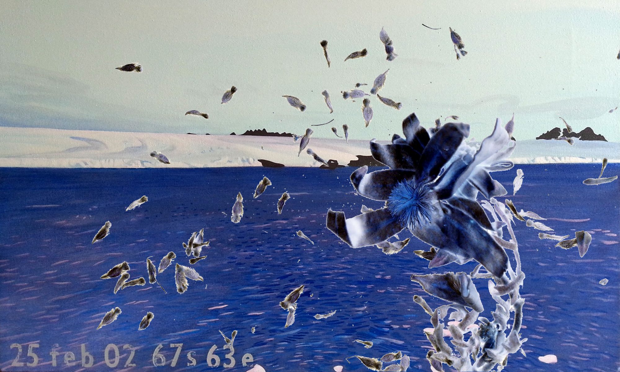
Maybe the pterpod could come to life instead of sitting so respectfully in the corner?
I want your eye on the sea levels. The pteropod respects that.
I considered dates and markers, but preferred it look like sea, unencumbered.
I’m excited about combining the graphical data with the Antarctic ‘characters’.
Now there’s another dimension on the horizon – 3D molecular modelling.
Our new housemate, a scientist at Sydney Uni, builds 3D moving models of ozone and other molecules, to test theories.
He has just shown me the software he uses to build them, and to set parameters within which they move and interact.
It’s amazing and beautiful and simple.
He showed me how molecules vibrate.
There’s all this invisible motion in the world that he can render.
He’s going to show me how to work his software, and suggested some ozone activity above the animated sea levels rising. I can see that.
There is a whole sea level rising data set – made from tide guages in Townsville, Bernie, Brisbane and Sydney. So I’m animating these to build a multiplaning sea. Creatures (including humans) can move beneath and above the sea levels.
I feel like I’m getting to the heart of what I want to do – gathering the bits – the characters and the props, kind of – which are really about my own stuff – wanting to know about the sea and the ice and journeying. It’s all so complicated, which is why I like simplicity.
Yes – but without some form of scale indicators the sea levels have no meaning. Just as temperature levels would have no meaning. That’s what I found so interesting about Al Gore’s film – his display of data. Data is dumb its meaning is derived from points of comparison and without those points of comparison it is simply artefact and consequently peripheral. Gore’s use of the mechanical elevator was brilliant and dramatic. It is always important to understand the dimensions of an information space.
It occurs to me that the same could be said of your web site. The problems people (and I’m one of them) are having navigating are actually spacial problems not solved by the addition of icons. What are the dimensions of this information space and how can we journey through the terrain of your ‘datascape’?
I had difficulty finding out how to spell Pteropod. I couldn’t use the search function without knowing how to spell it. My only tools were the left right arrows at the top and the months in the right hand menu. But I picked October and went through every screen until I found it. I did find it but there must be better ways. You may remember me talking about Ben Shneiderman and ‘spotfire’
http://www.cs.umd.edu/hcil/spotfire/
WordPress is not so easy to mess with but I think as you work with how to display animated data you should keep in mind how you might apply what you learn to the overall structure of your exegesis as a research space.
Can’t wait to see what you do with the 3D!
I’m aware of the scattergram for accessing data, and am considering it as an alternative interface for the http://www.antarcticanimation site.
As I develop animated elements of Antarctic motion and change – like the pteropod, aurora and sea level rising – I can have an array.
This version of the sea level animation have more information, but it’s dry.
I want to integrate the imaginative and the informative.
There’s a lot more pulling apart and reassembling of the information before that can happen.
Yes, there is a tension between the hard lines and numbers and the fluidity of your ascent trail. But I think the fade-in works well and I think it is richer and more powerful for the calibrations.
What if you hand-drew the dimensional calibrations?
What if the sound of the pteropod was generated by the shape of the ascent trail/waves? In other words are you able to integrate the visual display with the sound waves? The ascent could be in pitch or volume or both.
What fun this is…
Yes! I love your suggestions of making sounds increase with the rising sea levels, and to hand draw the calibrations. I will do both these things. Using Flash, the sound will not technically be generated by the rising graph, but can appear to be.
A thesaurus is repository of different meanings people attach to words. A visual thesaurus can suggest different meanings to Antarctic animations, depending on their context.
For example, here is the sea level rising animation without the calibrations, and a pteropod floating beneath:
http://www.antarcticanimation.com/content/thesaurus/s/s.php
I’m getting enough material now to start animating icons, or motifs, to integrate the scientific and the aesthetic perspectives within the one environment.
I finally met Stephen Eastaugh in the flesh. We spent three hours talking, and walking to Elisabeth’s gallery in Glebe, discovering we grew up in nearby Melbourne suburbs, and that both our fathers were peripatetic seamen.
He’s very happy for me to animate his Antarctic icons, so I can get going on those now.
We’ll show Antarctic work together in Glebe in 2008, with some other Antarctic artists.
That’s good that you are talking to Stephen.
When its deep in the night with no moon and I need to fill the kettle. I sometimes don’t bother to open my eyes. I listen to the sound of the water in the kettle as it rises. Perhaps you could apply the same principle to your aural indicator.
What’s happened to your pteropod in the Thesaurus entry? I like the way he showed us we were in sea water…
My musician friend only just finished his year 12 exams. He’ll be on deck again shortly to help with such things. I know what you mean. It’s about pitch, not volume.
The pteropod, I agree, should accompany sea levels. I’ve lost the original files, which I need to incorporate her here.
.
Today was my first Drawing through Moving workshop. We moved landscapes. One of my students has moved at Lake Mungo, with Tess de Quincy – moving in response to that place:
http://www.bodyweather.net/